I downloaded data from Fangraphs for 2014, 2015, 2016 and 2017 up to May 8th containing GB/LD/FB%, Pull/Center/Oppo%, and Soft/Medium?hard contact%, brought it into Tableau and started exploring, understanding, and visualizing the data. With a goal in mind I had to do some data manipulation and duplication, but I like the result.
In the near future I will update the data for 2017 to see if the trend continues, ideally to a point where the data updates automatically. Another plan is to describe in more detail how I made the radial charts, and what needed to be done with the data to do so. Lastly I'd like to make these available for iPhone and iPad.
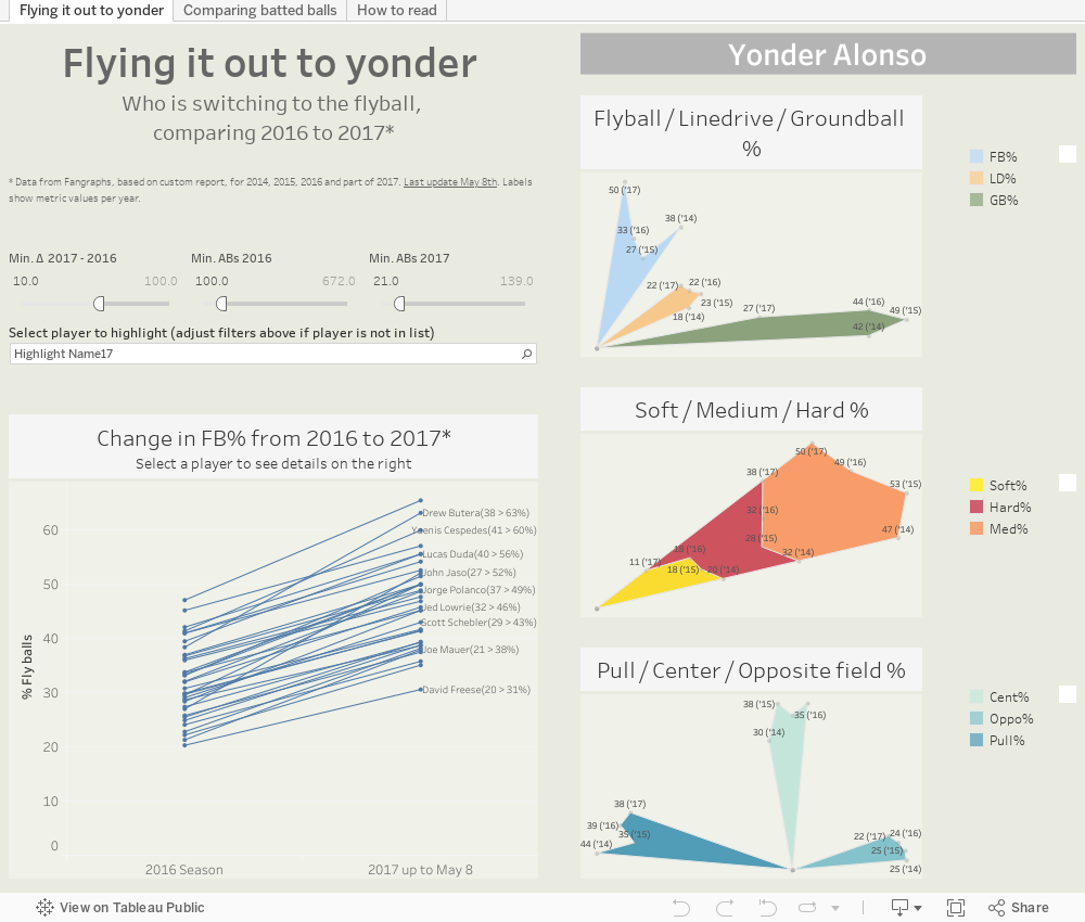
Tab one of the dashboard allows the user to set some parameters for minimum At Bats in 2016 and 2017, as well as filter only the biggest "risers". This filters the data shown in the graph below it and avoids the cluttered mess one would see with all data shown. A player drop down can be used to highlight a player of interest, assuming he is not filtered out by the parameter settings. Clicking on a player in the line graph then shows the 4 years' data per metric for that player. By default Yonder Alonso (who else?) is selected:
The second tab lets the user compare different players, per selected metric. Although there is no limit to the number of players that can be selected, after 4 or 5 it becomes hard to read. The last tab helps to understand the radial graphs, but hopefully no one will have to look at this tab.

No comments:
Post a Comment